| The colour scheme was inspired by the earthy hues of Canada’s landscape. The look was developed by Tyler Brûlé, founder of Winkreative, who hails from Ontario. |
| Matt Robinson designed the uniforms to be worn by the line’s “guest service providers.” |
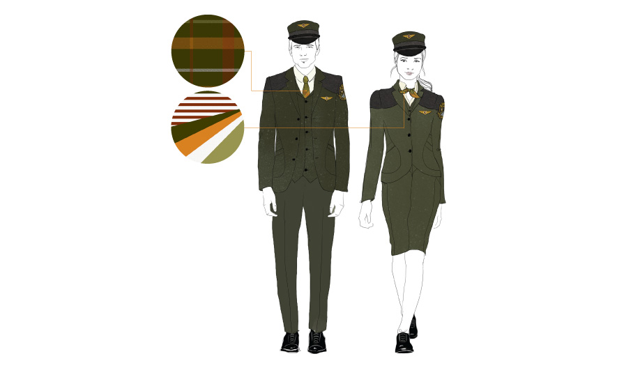
| The colour scheme was inspired by the earthy hues of Canada’s landscape. The look was developed by Tyler Brûlé, founder of Winkreative, who hails from Ontario. |
What does the branding for Toronto’s new rail link – which includes uniforms that tap into military chic in a woodsman palette that evokes the past – tell us about modern-day rail travel?
If there ever was a golden age of rail travel, it was probably because there were a lot of trains. We cut down on ours dramatically in the 20th century, yet we have developed some kind of idea that train travel was more luxurious back then – an Orient Express full of champagne and spies. Air travel, ditto: some of us can remember when airplanes had seats rather than slots, and if not we have at least seen Mad Men, where bombshells in short skirts serve martinis to high-flying businessmen. Key to those myths are the uniforms: a sleek skirt, a pillbox hat, a tailored suit; these are powerfully romantic gender symbols.
A uniform transmits authority, too. It needs to suggest a wearer who sets firm rules, so a designer must balance signifiers of officialdom and elegance. Hence the gentle military echoes in the daringly original uniforms unveiled for the Union Pearson Express, Toronto’s new airport rail link. They are the work of Matt Robinson, founder of artisanal clothiers Klaxon Howl, whose Queen Street West store is known for its tweedy suits and workwear with a nostalgic look. His sombre uniforms centre on fitted jackets in a colour between hunter and olive green. There are dark brown accents in patches of water-resistant gabardine over the shoulder yokes, as if to protect the upper body from rifle recoil. The jackets are worn with waistcoats and paired with grey trousers or green pencil skirts.
The hats, though, are what truly give the ensembles their distinctive forest ranger feel: a cap Robinson calls Bancroft evokes both 19th-century rail conductors and Alpine woodsmen; an alternate hat for women, the Garrison, is a military wedge that says air force and Girl Scout at once. Robinson is a collector of vintage militaria, and he says he was largely inspired by uniforms of the 1940s and ’50s.
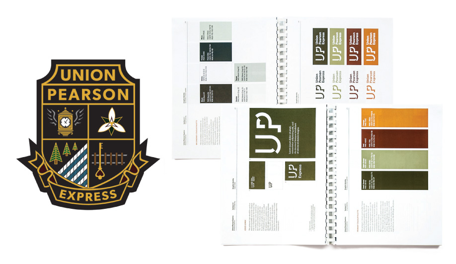
The colour scheme is the brainchild of Winkreative, Tyler Brûlé’s branding firm, which, not coincidentally, hatched the navy uniforms that have made Porter Airlines such an icon of stylish travel. However, Winkreative’s newest brief was different: here, the referent is not concrete and glass but trees and earth. UP Express president Kathy Haley lists the inspirations for the palette: “snowy winters, reclaimed wood, the Ontario landscape,” and the trains sport stripes in the same hues. Even the satchels that carry the electronic ticketing devices used by the guest service providers (not conductors!) are made of leather, with a pre-digital-era look. Authority is largely effected by the grandiose crest solely designed for this 25-kilometre stretch of track. It’s laden with local symbols – a clock with wings, a trillium, some pines – worn as a shoulder patch, adding a fussiness that might make a suit designer nervous, but certainly adding to the military aplomb.
“We are the train at the end of the plane,” Haley likes to say, a mantra that sums up the tricky balancing act that the image of the new rail link must effect: it’s a commuter train, but it wants to feel like an extension of your business flight. The woodsman aesthetic is, of course, now urban as well: one would not be surprised to see bushy beards on these guest service providers toting leather satchels. Here, corporate and counterculture aesthetics once again become aligned.