When Brooklyn treat-maker Van Leeuwen ice cream hired Pentagram to refresh its branding, the goal was a stronger visual identity. The result was an unbelievable uptick in sales.
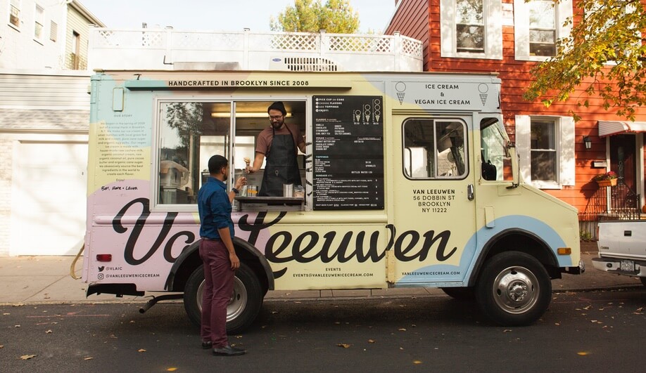
Van Leeuwen Artisan Ice Cream got its start in a Brooklyn apartment in 2007, when the company’s three founders decided to revive traditional ice cream-making techniques with a short list of fresh ingredients. Ten years later, the company has grown into a small empire, with multiple storefronts and trucks in both NYC and Los Angeles selling regular and vegan flavours like Sicilian pistachio and earl grey tea.
Last year, the Van Leeuwen ice cream team decided it was time to freshen up its look in order to gain visual recognition in the crowded ice cream marketplace. The team turned to Pentagram, the illustrious graphic design consultancy, to rework its visual identity and its packing. Led by partner Natasha Jen, the Pentagram team set about on creating an aesthetic that was simpler, yet stronger than that of the competition.
“I immediately noticed that the packaging design blended into the noisy shelf space with other ice cream brands. Every brand is very decorative. So the goal was clear from the get-go: to differentiate Van Leeuwen visually in a way that’s dramatically different from other brands,” Jen says. “We noticed that ice cream, as a category, tends to be visually chaotic with all kinds of vernacular design motifs and typefaces, so we decided to make our design sort of the opposite of that: how can we use the minimal means to create the most optimal result?”
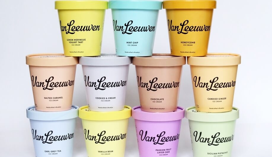
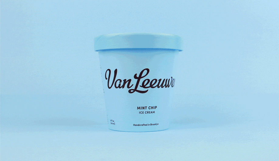
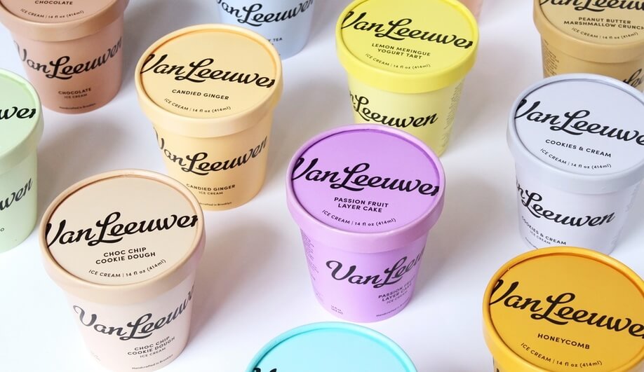
The most optimal result was a minimal, colour-driven approach that made the existing Van Leeuwen logo (designed by Cathe Holden) the dominant element on the packaging. “It’s minimalism anchored in American ’50s retro,” Jen says. “There’s a familial quality about it that feels friendly and gentle, yet there’s a premium design in it that sets it apart from competitors.”
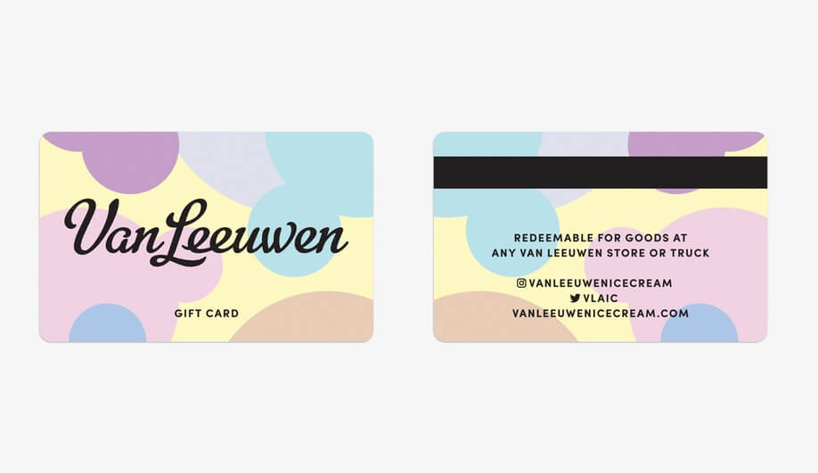
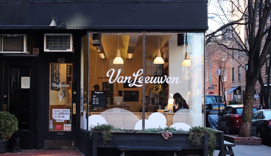
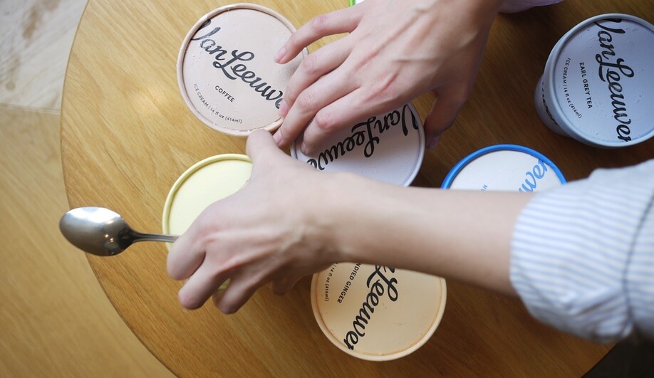
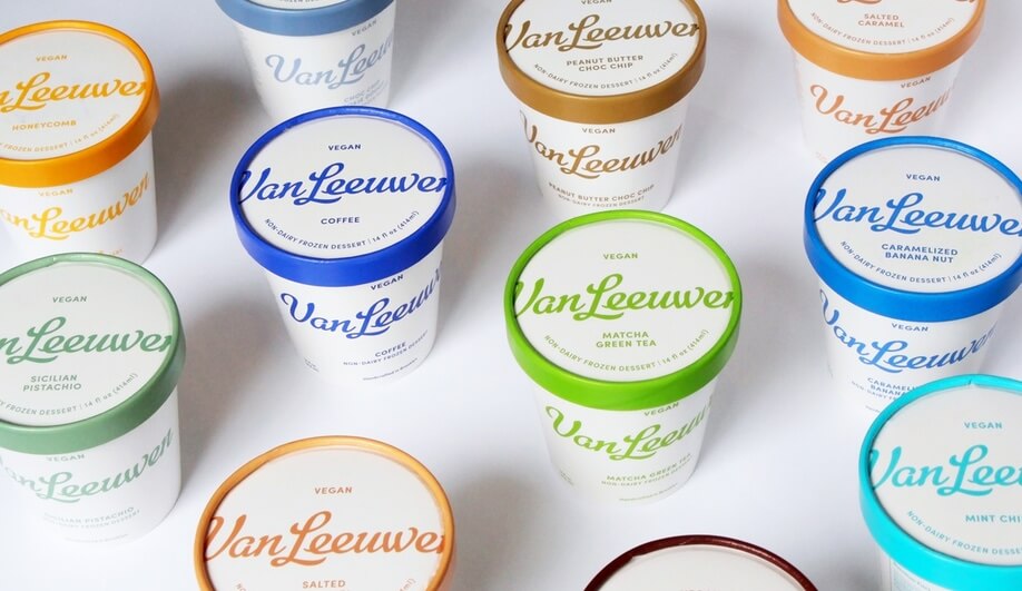
The packaging for the classic line was redone in a palette of pastel hues. The vegan line uses white containers, differentiated by coloured text and lids. The simplicity adds what Pentagram calls a “homespun and practical” quality, intended to reflect the purity of the ingredients and to help customers quickly identify flavours. The new identity has also been extended to gift cards, ice cream trucks and storefronts.
The effects of the redesign were nearly immediate. Sales of Van Leeuwen ice cream increased by 50 per cent at Whole Foods. And snaps of ice cream pints began popping up all over social media. The new identity is, evidently, highly Instagrammable (the caption on a recent shot of side-by-side containers reads “How could I not buy these colors”).
“We want our design to work great and look great, everywhere, all the time. Being visually pleasing on social media is just a by-product of a higher goal,” Jen says.