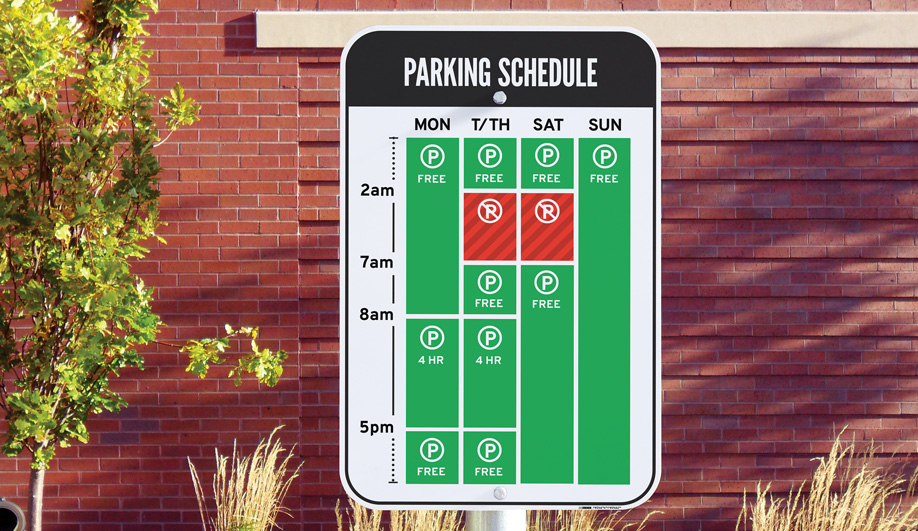
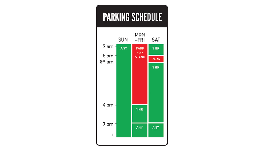
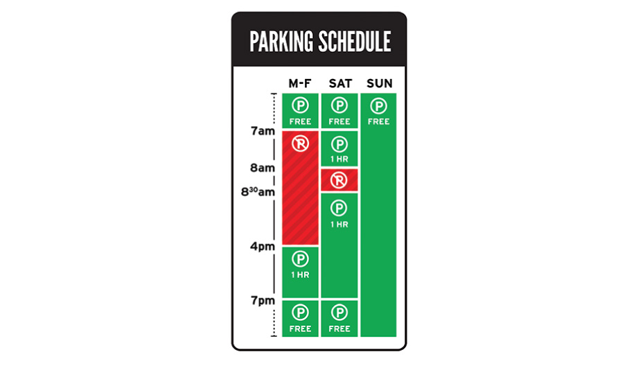
Graphic designer Nicole Sylianteng has come up with a single street sign that puts all parking restrictions in one place, and is legible to all – even people with colour-blindness.
Nearly one in 12 of us lives with some form of colour vision deficiency (including yours truly). For such people, navigating a world where indicator lights and map legends can look virtually indistinguishable is difficult at times. Design that goes beyond the spectrum to convey information is beginning to take hold across disciplines, even in the digital world, as developers explore unique shapes and orientations for icons that were once differentiated only by colour. “Whatever works for colour-blind people will work for others, too,” says graphic designer Nicole Sylianteng, “so it’s a good thing to aim for.”
She created To Park or Not to Park?, a signage pilot project now under way in Brisbane, Australia, and Los Angeles, which makes parking signs far easier to read, especially for those who have trouble distinguishing hues. The project was sparked by a fine she received, the result of a cluttered, ambiguous street sign that was confusing even to those with perfect sight. “I’ve always been the type to notice everyday problems and try to figure them out,” she says. “My goal was to answer the question ‘Can parking signs be made clearer?’ ”
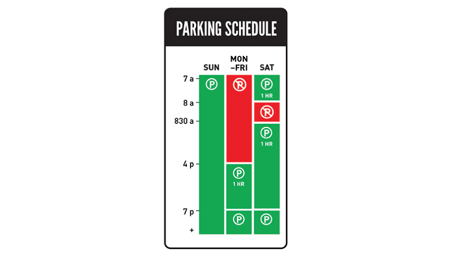
Her original template, which radically simplified seemingly contradictory signs into a single all-inclusive one, was initially met with both encouragement and criticism. People liked the clarity, but the red and green used to specify times were difficult to read for people with certain types of colour-blindness (distinguishing red from green is the most common form). “Their comments showed me that they were already jumping ahead to the next obstacle.”
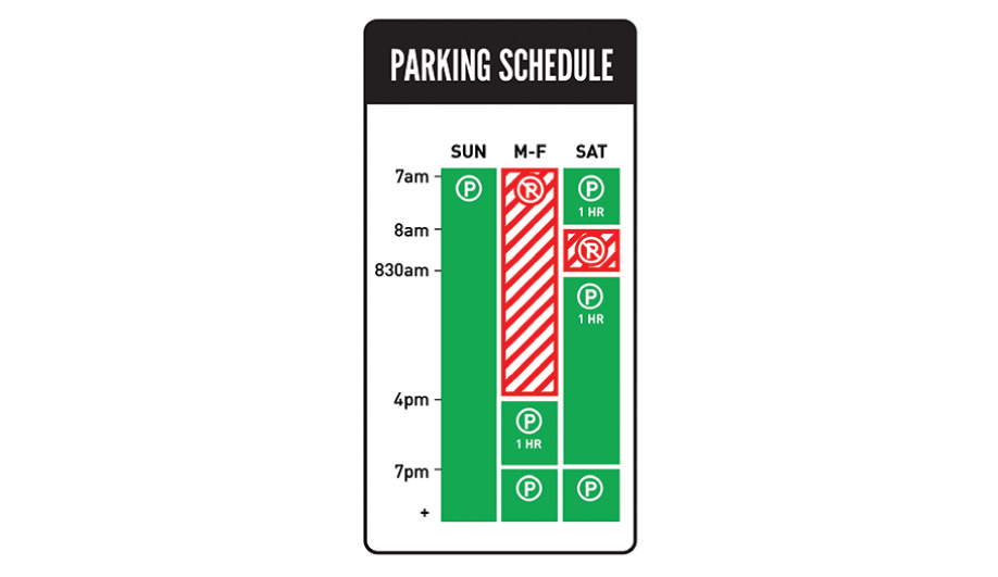
To address the problem, Sylianteng formed a colour-blind focus group to get detailed feedback. Based on her findings, she reworked and refined the patterns to visually convey the park / don’t park information in multiple ways, adhering to a central maxim: never rely on colour alone to get your message across. With the first prototypes now on selected streets in Brisbane and Los Angeles, Sylianteng hopes other cities will soon adopt her parking signage.

