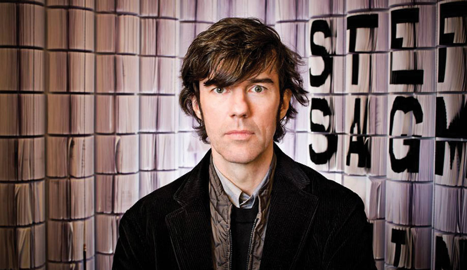
| Q&A: Stefan Sagmeister |
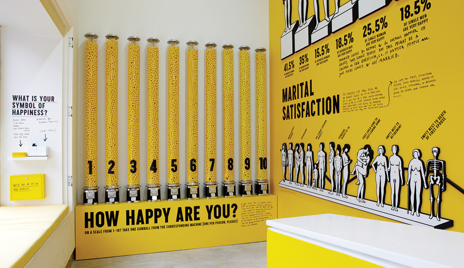
| Visitors can indicate their happiness levels at the gum ball machines. |
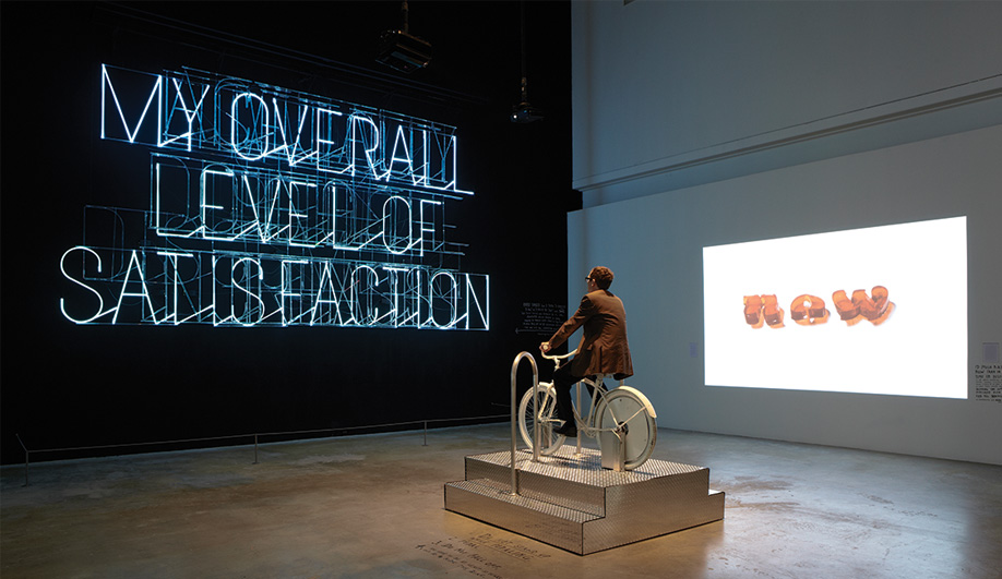
| A provocative, pedal-powered neon sign. |
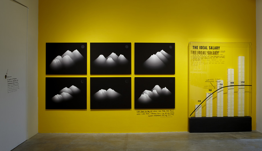
| The Ideal Salary scale |
| An interactive digital work that responds to passersby, |
| An installation made of sugar cubes and lights up through software that recognizes smiles. |
| Q&A: Stefan Sagmeister |
The envelope-pushing graphic designer behind The Happy Show at Toronto’s Design Exchange.
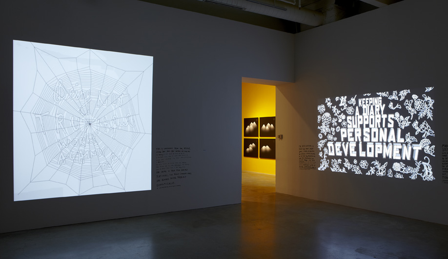
At the opening of his exhibit last night, Sagmeister prefaced a tour for the packed-to-capacity crowd by explaining that the show’s collected insights are not meant to be ironic or cynical. Taken honestly, the New York–based designer’s installations – gum ball machines numbered from 1 to 10, with the levels of gum dispensed illustrating showgoers’ average level of happiness, and figurative stencils (naked bodies, the seven continents) outlining such themes as marital and geographical happiness – convey Sagmeister’s hard-earned maxims. What ties the show together, beyond its palette of smiley-face yellow, black and white, is his handwriting on the walls to accompany his more formal video and illustrative works.
Ahead of the opening, we spoke with Sagmeister about bringing the exhibit into the gallery’s unofficial spaces, determining typographic treatments and what that pedal-powered neon sign is all about.
How did you weave together the various elements of the Happy Show?
There are a lot of spaces, some connected, some disconnected, so I decided to put our old trick of handwriting into the show, and that made everything easier. It was necessary to have some sort of common thread to move the people through. And it gives them an opportunity to linger.
You use unlikely areas, such as bathrooms and wheelchair ramps, as exhibition space. Why?
We do stuff in the bathrooms, in the hallways, in all of the little non-spaces that museums never do anything with. But they are there, and if you treat them correctly you can make little nooks where you can speak more closely to a visitor. Information is always beautifully communicated if you can open up people’s attention with a little surprise. From a spatial point of view, that is easier if you hide something in a space that used to be the janitor’s closet.
Do you edit the content of your maxims to suit their typographic treatments?
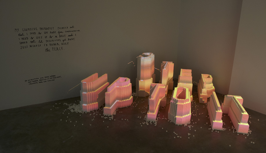
I wrote 15 sentences extremely fast, as a list in my diary, “Things I Have Learned in My Life So Far” [published by Abrams Books, 2008]. The next bunch were written more consciously and probably more carefully, but I might have had 10 versions of them. We’re doing a new one now for the film, and it has several versions; one is “Achieve Elastic Tenacity,” the other “Be More Flexible.” We’re going with the latter because it expresses the same thing much more clearly. If the sentence is as clear as possible, we can be more opaque formally. If the form expresses the content, the viewer doesn’t have a chance to interpret it.
How do you resolve the treatment of a maxim?
There are some projects where we deliberately have no idea what the outcome will be, and that goes against my natural instincts. I’m comfortable knowing where we are going, but it has the advantage of being fairly safe, and the disadvantage of losing spontaneity. The reason I don’t do it more often is because it’s scary, but the results are always good. Some of our better-known pieces, including the “Trying to Look Good Limits My Life” billboards, were done using that approach. The ideas can come out of the sentence or a gut feeling, or sometimes I have a desire to go in a certain direction and it just opens a completely new world or new meaning for that sentence. It’s all over the place.
What’s the story behind the neon sign that lights up when people pedal the stationary bicycle?
“Actually doing the things I set out to do increases my overall level of satisfaction.” That’s just it. I found that whenever I think I should do something and I don’t make a note and forget about it, it leaves a kernel of dissatisfaction with me. I also discovered that exercising for 20 minutes in the morning played a more discernible role in my day than meditating for 45 minutes, so I wanted to have an element of exercise. I worked with Kevin T. O’Callaghan of the School of Visual Arts; he knows the guy on Long Island who made the neon sign.
What inspired the Step Up to It sugar sculpture?
Sugar is highly related to happiness. The cubes are white, so we could project on them. It’s a silver screen kind of thing, and I think it’s pretty. It wasn’t meant to be interactive, but the programmers, Red Paper Heart, brought that element in. Face recognition software allows the visitor to interact by smiling, lighting up the sculpture with a burst of colour. It changes the way the audience looks at it.
The Happy Show runs until March 3 at the Design Exchange in Toronto. This interview originally appeared in Azure‘s January/February issue, on newsstands now.