For Montreal restaurant Maneki Comptoir Asiat’, local firms Rainville-Sangaré and Studio Beau collaborated to create a casual cool pop culture–inspired interior.
It’s easy to miss Maneki Comptoir Asiat’ from the street. One of a handful of businesses in a nondescript strip mall in Montreal’s Hochelaga-Maisonneuve neighbourhood, there is nothing to suggest that the interior of the casual Asian restaurant is any more interesting than the exterior.
Thankfully, it is. The young owners of the new restaurant tapped Rainville-Sangaré, a local interior design firm, and Studio Beau, a Montreal branding agency, to transform the space (which for years served as a Chinese restaurant) into a playful environment to match their laidback menu.
“We had a ‘carte-blanche’ with a very small budget,” says the Rainville-Sangaré team, who managed the overall interior design, including lighting and furniture, while Studio Beau was tasked with developing the visual identity of the Maneki brand. “They wanted something young and casual.”
The firm retained none of the unit’s existing elements, starting fresh with the 57-square-metre space. Along with Studio Beau, the designers turned to Asian pop culture, imagery and motifs for inspiration.
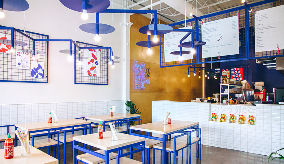
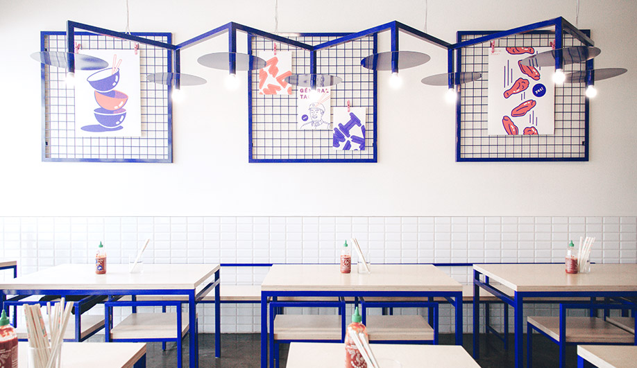
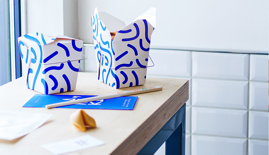
Electric blue is the primary hue inside Maneki, showing up as a zigzagging overhead light fixture, frames on the plywood chairs and tables, and the metal grids lining the walls, onto to which artwork and menus are clipped. “[The colour] was inspired by the busy night lights from Asian streets,” Rainville-Sangaré explains. It pops against Maneki’s white walls, partially covered with white subway tiles, and concrete flooring finished with epoxy.
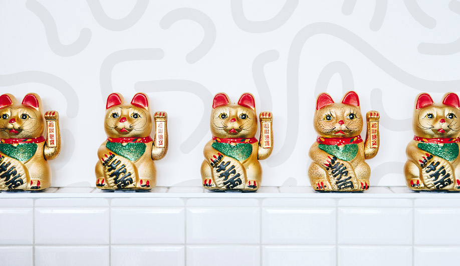
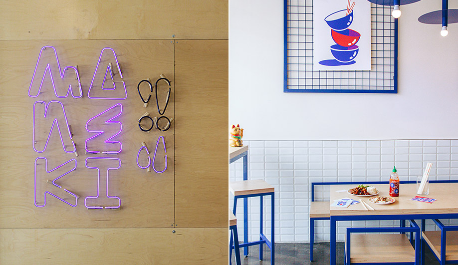
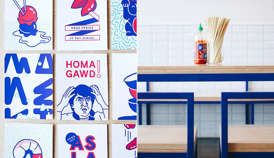
Studio Beau applied the same neon shade to the takeout containers, business cards and graphic art prints they created, the latter of which features famous figures, dishes, pop songs and maneki-neko, the popular paw-waving good fortune feline. “We shared the same working space while working on the project so it was easy to get ideas to the other side of the table,” Rainville-Sangaré says. “A difficult part was the colour matching job – the blue had to be in neon, metal, wall paint and print.”
The plywood-and-blue-metal chairs and tables were designed by the firm, as were the wall grids and the light fixtures, save for the the neon light depiction of the restaurant logo, designed by Studio Beau and fabricated by a local neon artist.