These minimalist retail interiors take simplicity to the next level, with striking pops of colour and subtle mix-and-match materials.

Element de Base’s pop-up, by Creative Flats
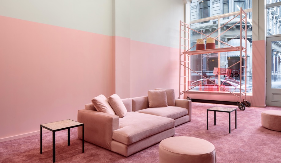
Montreal furniture brand Element de Base is, like so many other retail startups, direct-to-consumer. Since the label launched in 2016, with sister-and-brother duo My and Thien Ta Trung at the helm, it has established a warehouse showroom and two separate pop-ups, each further solidifying the brand’s penchant for clean lines and vibrant colours. But while each physical location valued bold simplicity, EdB’s most recent pop-up – which was in Old Montreal until last February – took minimalism to new levels.

Conceived by local design studio Creative Flats, EdB’s pop-up is defined by its use of colour – namely, green and millennial pink. There’s not much in here at all: colour-coded carpets, scaffolding, plants by Vertuose, custom-made LED lights, exposed brick, and paint, form the basis of the decor. Beyond that, the showroom only features couches, side tables and accessories by EdB.

With colour-coordinate walls and floors, the space partitions itself, all while achieving retail’s basic goal: placing product in the spotlight.

Frame’s Soho location, by Christian Halleröd
There’s a gallery-like quality to all four of Frame’s denim boutiques, but their recently opened New York boutique, at 51 Greene Street, may be the brand’s most striking. Conceived by Swedish designer Christian Halleröd – who also designed Frame’s Los Angeles and San Francisco locations – the space is both stripped-down and elegant. Painted ductwork, stark LED strips, and matte stone flooring lend the store a distinctly industrial feel, a nod to Soho’s manufacturing past.

Throughout the store, sculptural pieces add intrigue. Upon entering, product is presented on a raw aluminum table, flanked by wall-mounted rails that serve as clothing racks. Lightboxes displaying black-and-white photography, a staple of Halleröd’s work for Frame, are placed strategically throughout the store.

As visitors venture further, they encounter two polished marble tables, a high-gloss powder blue shelf and a walnut sales desk – an experiment in mix-and-match materials that, in a busier space, would overwhelm.

Kith’s West Hollywood location, by Snarkitecture
One of Snarkitecture‘s primary goals, co-founder Alex Mustonen told Azure, is to engage people who “maybe think that architecture is too serious.” Kith’s Los Angeles location continues the New York studio’s reputation for playful, and willfully strange, work. For their seventh collaboration with the streetwear brand, Snarkitecture eschewed its signature all-white environments for a space filled with polished concrete, pops of foliage and brass accents.

Upon entering the store, visitors are greeted by the first piece of Snarkitecture oddity: a ceiling featuring 200 casts of Air Jordan sneakers. Shoppers can wander to a cereal bar, browse clothes hanging from brass, wall-mounted rails or explore objects in vitrines. Up a set of stairs, a similar motif continues – save for one surprising element.

The minimalism comes into play on the store’s second level, which is anchored by a glowing glass volume, made from a series of glass fins. Inside, the palette changes entirely: shoppers are surrounded by the store’s rarest sneakers, which they can test out on two marble benches. Even the flooring changes, swapping polished concrete for tiles laid in a herringbone pattern. It’s delightfully unexpected – and certainly delivers on Snarkitecture’s playful ethos.