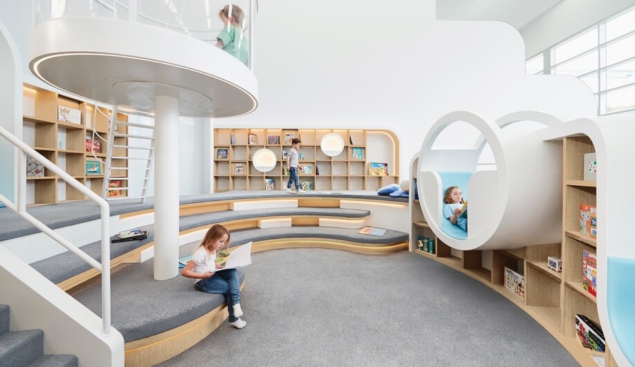
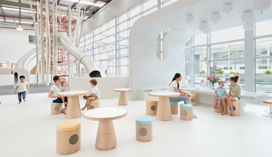
Avoiding the garish colours and plastic toys typical of a children’s centre, Frost*collective and PAL Design try out a simplified design concept at NUBO.
The focus of NUBO, a recently opened play centre in Sydney, Australia, is to provide a place for “pure play.” Translation: open-ended play that encourages growth through exploration and connection.
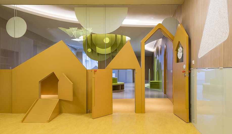
Tapped to take that concept and apply it to a physical environment, multidisciplinary design firm Frost*collective and interior design consultancy PAL Design decided to do away with the clichéd idea of what a space for children looks like – bright, primary colours and battery-powered doodads – and try for a subtler, more calming aesthetic.
The brand name, NUBO, was the catalyst for the resulting interior design and visual identity. The word nubo translates as ‘cloud’ in the international auxiliary language of Esperanto, which was devised in the 1870s as a way of encouraging harmony between different countries.
“We then came up with the idea of cloud gazing that conjures up unique and different things for different people,” says Ant Donovan, group creative director at Frost*collective. “This singular idea – of exercising the imagination – informed the architectural design concept, while also steering the direction of our brand identity.”
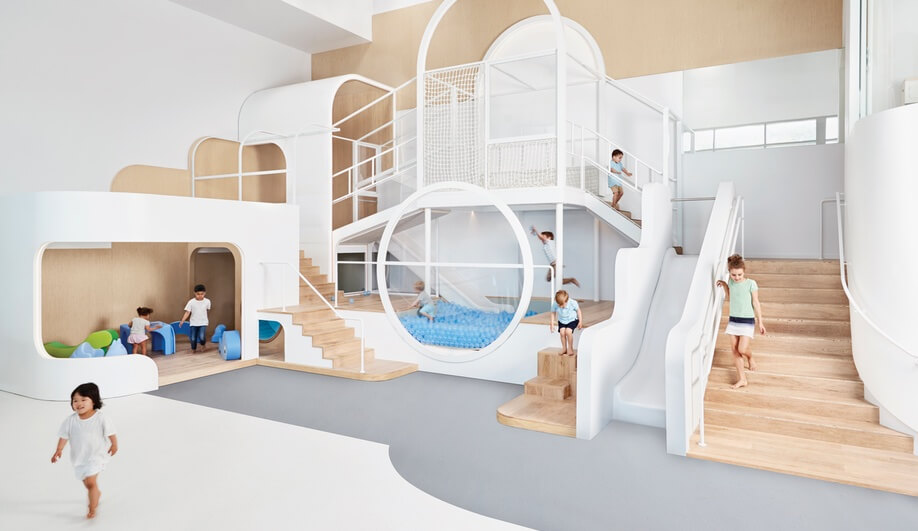
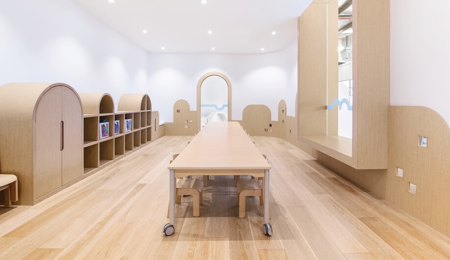
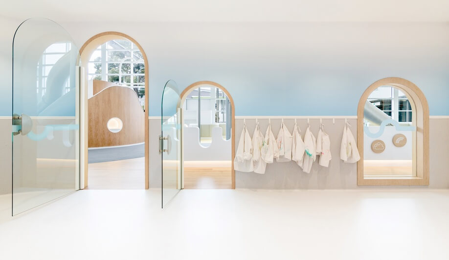
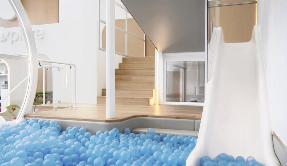
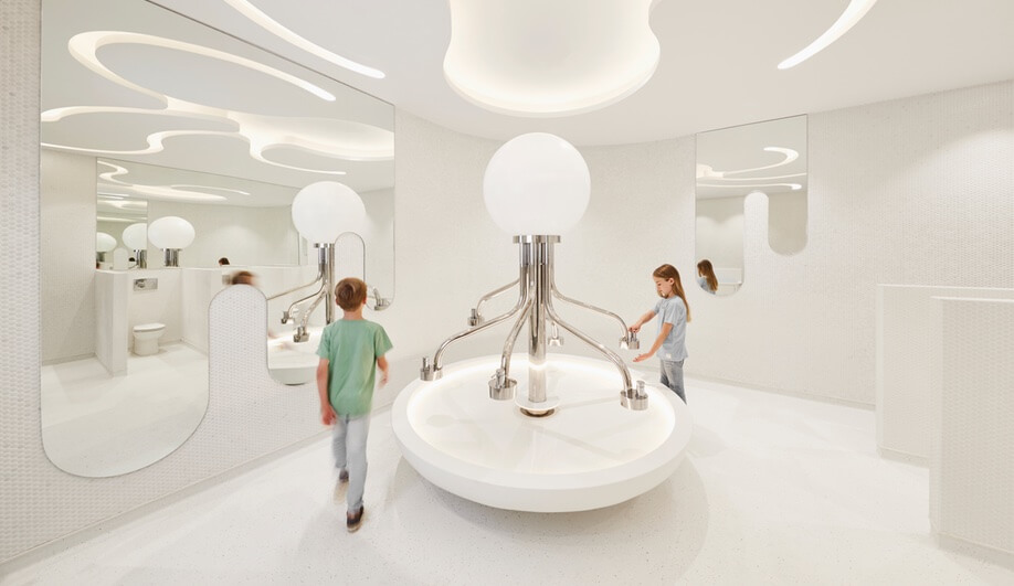
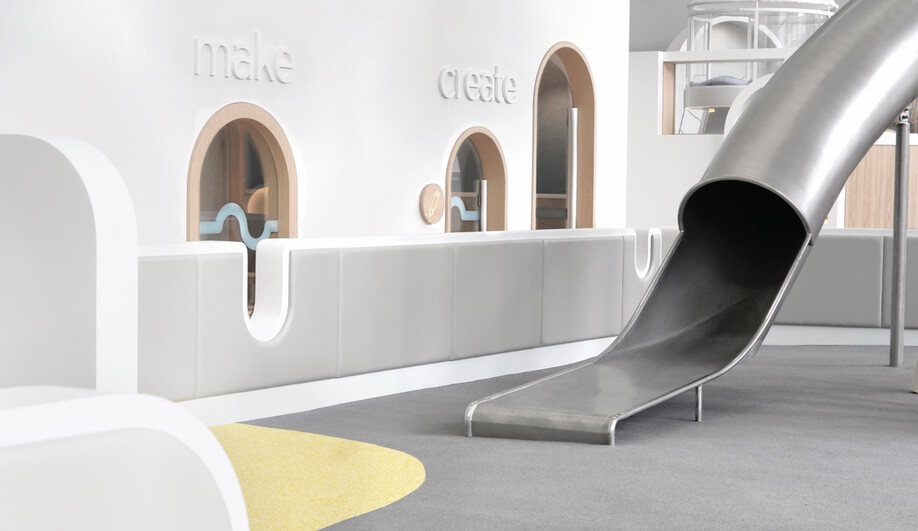
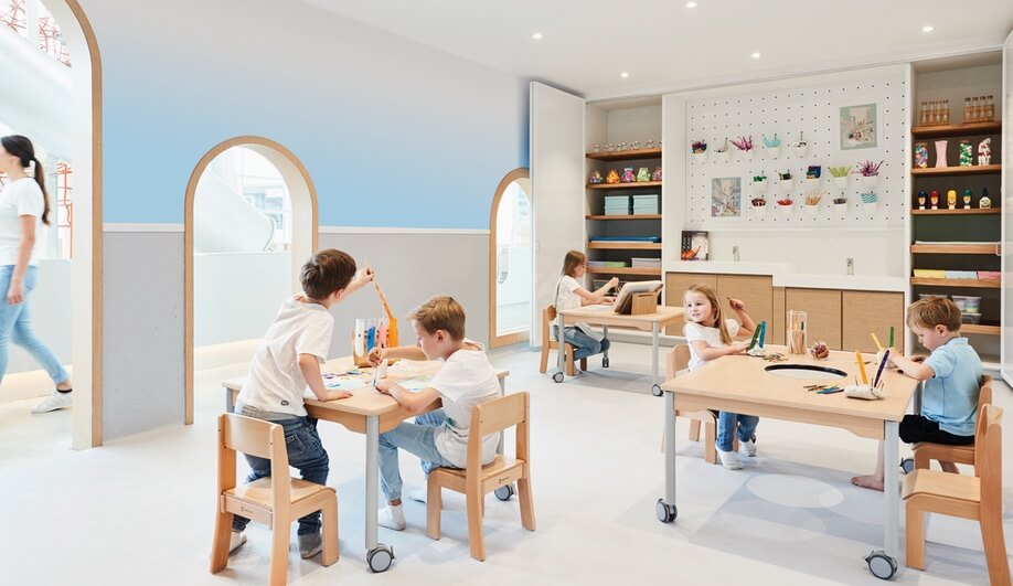
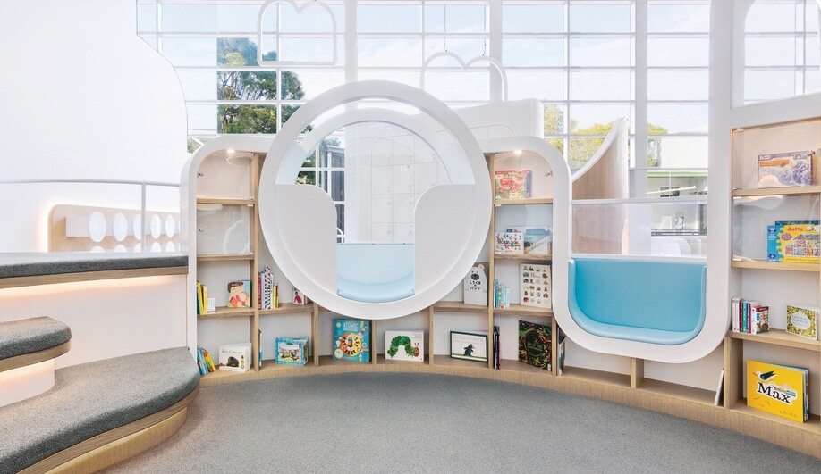
A simple palette of white, natural wood and sky-blue dominates the 768-square-metre space, which is comprised of different zones. Amongst the zones are an “active play” area, where kids can climb, slide, and jump into a ball pit, a building room equipped with kid-friendly materials for construction and craftwork, and a library, featuring curved bookshelves and lots of playful nooks and crannies for curling up in. Surfaces were designed with safety in mind; vinyl coverings and rubber flooring were used extensively.
“Customised furniture with fairy tale-like clichés gave way to a neutral palette of white and wood, with a few touches that bring back happy care-free childhood memories,” says Joey Ho, principal at PAL Design. “Wood materials create a sense of homey and comfy atmosphere. Materials are suited for children in their various stages of learning to safely and explore the entire space.”
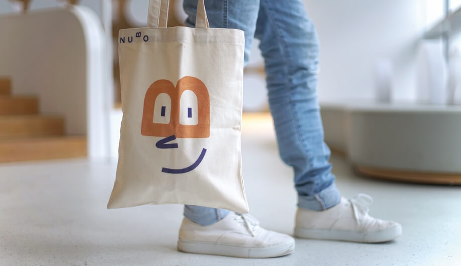
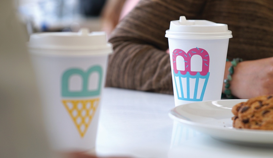
Urbanite, a wing of Frost*collective, extended the interior design into the branding, maintaining a simple colour palette and childlike expressions. The team took the ‘B’ from NUBO and used it as the primary design device in signage, products and other branding, flipping it around to form ice cream scoop and cupcake illustrations, and eyeglasses on caricatures.